Dropdown
When the user selects an option, you can perform a specific action, such as updating data, opening a page, and so on. You can set the list contents manually in the properties of the control.
Properties
| Name | Description |
|---|---|
| Name | The name of this control. |
| X | Distance of the left side of the control from the left side of the canvas. |
| Y | The distance from the top of the control to the top of the canvas. |
| W | Width of the control. |
| H | The height of the control. |
| Dropdown Name | The name of the drop-down option.  |
| Dropdown Value | The value of the drop-down option.  |
| Selected Text | The text of the currently selected dropdown option. |
| Selected Value | The value of the currently selected dropdown option. |
| Selected Color | The background color of a dropdown option that is displayed in the dropdown list when the option is selected. |
| Hover Color | The background color of the dropdown list when the mouse is hovered over a dropdown option. |
| Maximum rows | The number of rows to display in the dropdown list before the scrollbar is displayed. |
| Row Height | Determines the height in px of each option in the dropdown list. |
| Fill Color | The fill color of the dropdown box. 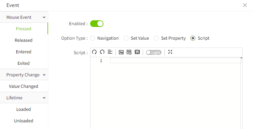 |
| Border Color | The border color of the dropdown box.  |
| Border thickness | The border thickness of the dropdown box. |
| Shadow | Sets the shadow effect of the control. You can set the outer shadow and inner shadow. Outer - Enable: Whether to enable the shadow effect - Color: Used to set the shadow color - X: Controls how far the shadow is shifted horizontally. X = 10 → shadow moves 10px to the right X = -5 → shadow moves 5px to the left - Y: Controls how far the shadow is shifted vertically. Y = 8 → shadow moves 8px downward Y = -3 → shadow moves 3px upward - Blur: Controls how soft or sharp the edges of the shadow appear. Higher values make the shadow more blurry and spread out. Inner - Enable: Whether to enable the shadow effect - Color: Used to set the shadow color - X: Controls how far the shadow is shifted horizontally. X = 10 → shadow moves 10px to the right X = -5 → shadow moves 5px to the left - Y: Controls how far the shadow is shifted vertically. Y = 8 → shadow moves 8px downward Y = -3 → shadow moves 3px upward - Blur: Controls how soft or sharp the edges of the shadow appear. Higher values make the shadow more blurry and spread out. - Spread: Controls how much the shadow expands or contracts from the shape. |
| Font | The font of the dropdown box. Includes font type, font size, font color, bold, slant, and underline settings. |
Event
Allows you to perform a specific event based on certain conditions. See the 2D Visualization-> Event page for a complete description of the various events.
Example
Opens the specified page when an option is selected in the drop-down list.
