Multi-State Button
Multi-State Button is a type of button control that can switch between more than two states. Each state can be configured with its own unique appearance (color, text) and corresponding action logic.

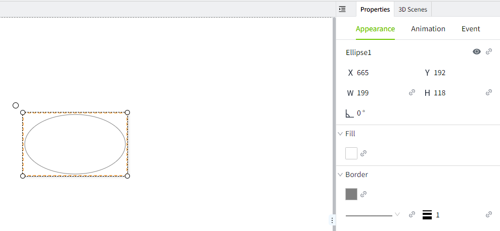
Properties
| Name | Description |
|---|---|
| Name | The name of this control. |
| X | The distance between the left side of the control and the left side of the canvas. |
| Y | The distance between the top of the control and the top of the canvas. |
| W | The width of the control. |
| H | The height of the control. |
 | The rounded corner curvature of the control. |
| Current Value | Match this value with the status value under the "Button" category. Based on the matching result, display the appearance of the corresponding button state. |
| Control Value | Bind to a property that controls the status. When the corresponding button is pressed, the current value of the button will be written to the property bound to "Data" -> "Control Value". Usually, the current value and the control value will be bound to the same property. |
| Border | Set the border width. |
| Button->States | Set the appearance style of the control when it is in different state values. You can add your own states as needed.  - Selected Text: The text content displayed when the button is in the selected state. - Unselected Text: The text content displayed when the button is in the unselected state. - Value: The value of the state. - Selected Background: The background color when the button is in the selected state. - Unselected Background: The background color when the button is in the unselected state. - Selected Font: The font color when the button is in the selected state. - Unselected Font: The font color when the button is in the unselected state. - Selected Border: The border color when the button is in the selected state. - Unselected Border: The border color when the button is in the unselected state. |
| Button->Style | Used to set whether the button is displayed horizontally or vertically. |
| Button->Button Gap | Set the spacing between two adjacent buttons, in units of px. |
| Font | Set the font for text content. Including font type, font size, font color, bold, italic, underline, horizontal alignment, and vertical alignment. |
Event
Allows you to perform specific events based on certain conditions. See the full description of each event on the 2D Visualization-> Event page.
Example
The running status of the device can be obtained through the Multi-State button control.
- Add a Multi-State button control to the page.
- The current value is bound to a numeric tag: "Demo:status". This tag is writable.
- The control value is also bound to the tag: "Demo:status".
-
Button properties are as follows:
-
Click the button on the running page to control the running status of the device and view the button style.
