Button
Buttons are used to initiate an event when pressed and can also be used to display status.
Properties
| Name | Description |
|---|---|
| Name | The name of this control. |
| X | The distance between the left side of the control and the left side of the canvas. |
| Y | The distance between the top of the control and the top of the canvas. |
| W | The width of the control. |
| H | The height of the control. |
 | The rounded curvature of the four corners of the button. |
| Fill | The content displayed by the control.  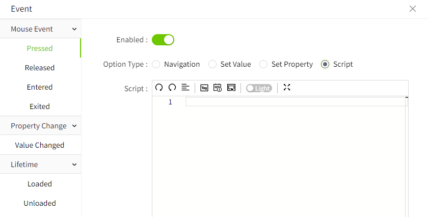 The button's background image. Only JPG, GIF, PNG, SVG, and JPEG formats are supported. |
| Border | The color and thickness of the border. |
| Shadow | Sets the shadow effect of the control. You can set the outer shadow and inner shadow. Outer - Enable: Whether to enable the shadow effect - Color: Used to set the shadow color - X: Controls how far the shadow is shifted horizontally. X = 10 → shadow moves 10px to the right X = -5 → shadow moves 5px to the left - Y: Controls how far the shadow is shifted vertically. Y = 8 → shadow moves 8px downward Y = -3 → shadow moves 3px upward - Blur: Controls how soft or sharp the edges of the shadow appear. Higher values make the shadow more blurry and spread out. Inner - Enable: Whether to enable the shadow effect - Color: Used to set the shadow color - X: Controls how far the shadow is shifted horizontally. X = 10 → shadow moves 10px to the right X = -5 → shadow moves 5px to the left - Y: Controls how far the shadow is shifted vertically. Y = 8 → shadow moves 8px downward Y = -3 → shadow moves 3px upward - Blur: Controls how soft or sharp the edges of the shadow appear. Higher values make the shadow more blurry and spread out. - Spread: Controls how much the shadow expands or contracts from the shape. |
| Color | Set the color effects for different operational states of a control. The states include: default, hover, and pressed. You can set the background color, border color, and font color for each state.  |
| Font | Set the font for text content. Including font style, font size, font color, bold, italic, horizontal alignment, and vertical alignment. |
Event
Allows you to perform specific events based on certain conditions. See the full description of each event on the 2D Visualization-> Event page.
Example
Click the button to navigate to other page.

| Property | Value |
|---|---|
| W | 80 |
| H | 32 |
 | 4 |
| Background | 1c1c88 |
| Text | < Back |
| Font | Calibri, 22, horizontal centering, vertical centering |
On the button, add a press event, select 'Navigation' as the operation type, choose 'Page1' as the page, and select 'Replace ' as the open position. On the runtime page, clicking this button will navigate to Page1.
